Mailbox Treats Your Email Like A To-Do List, Is An Excellent Alternative To iOS Mail [Review]
Mailbox is here to fill the big, wide void left by Google-acquired Sparrow third party mail app for iOS. It takes the best features of the built-in Mail app, Gmail 2.0 and to-do list apps like Reminders, Any.DO to create a truly magical app for managing email on the go. Check out our full review after the jump.
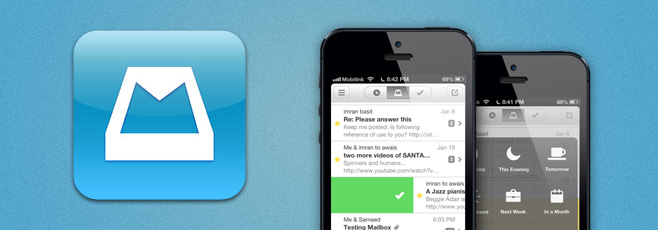
The app comes from the folks behind the award-winning “Orchestra” task management app – Orchestra, Inc. The startup looked at how people were using their task management app and found that users were regularly sending emails to themselves that served as reminders for tasks, and – as in my case – leaving low priority email messages as “unread” to come back to them later.
Mailbox has been developed with the aforementioned situations in mind. It treats each email message in your inbox like a task in a to-do list. If an email is super important, you can quickly reply to it right away like you would in any other traditional email app, or if you do not wish to deal with it at the moment, you can quickly “snooze” it to later today, evening, tomorrow, the weekend, next week / month or to a specific date. These snoozed messages are then placed in a separate list that you can access later, allowing quick management of your inbox. You are reminded to check snoozed messages at a later time.
Mailbox is here to fill the big, wide void left by Google-acquired Sparrow third party mail app for iOS. It takes the best features of the ...
This is the post without thumbnail
The thumbnail will show if your post have image and the host which you use to save your image is Picasa Web


The thumbnail will show if your post have image and the host which you use to save your image is Picasa Web
This is the first post

The first post of the greatest blogger template. Up there is a picture. Down have no picture. The post haves only one picture.

The first post of the greatest blogger template. Up there is a picture. Down have no picture. The post haves only one picture.
Bitcasa Sheds Beta Tag; Comes To iOS With Automatic Camera Uploads
Despite being in beta for the past few months, Bitcasa has already gained considerable popularity. Infinite cloud storage might be nothing more than an illusion, but this service comes closest to making it a reality. Bitcasa gives its users 10GB of free cloud storage, with two ways of expanding this limit. You can subscribe to an unlimited package for $10/month, or get 1GB of free space for each new user you bring to Bitcasa. Apps for the service have already been around for Windows and Android, and now its iOS app has made its way to the App Store as well. The app lets you access your Bitcasa content and view a variety of file types on your iPhone. There is also an automatic upload feature similar to the one offered by Dropbox and Google+ on Android, which allows you to connect your camera roll with Bitcasa so that your photos and videos are always kept backed up on the cloud. As before, all data you upload to the cloud service is kept secure using encryption.
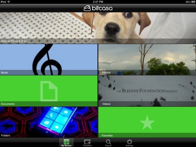
New users can sign up for a new Bitcasa account right from the app. You can register using Facebook, Twitter or an email address. Once you have registered or logged in, Bitcasa asks you to connect your iPhone’s camera roll with the app. You can skip this. but the feature is useful for unobtrusive photo uploads without having to worry much about storage space.
The ‘My Bitcasa’ page of the app has quite a unique interface, with separate tiles for different file types. There are sections for music, videos, photos, documents and folders. The cover image of each tile changes depending upon your usage. The big tile at the top of the screen shows a preview of the file you viewed most recently.
Bitcasa has built-in viewers/players for PDF files, office documents, photos, videos and songs. All file links can be further shared using email, SMS, Twitter and Facebook. You can also copy the URL and paste it anywhere you want. To save a file for offline viewing, long-press on its name and add it to your favorites.

Despite being in beta for the past few months, Bitcasa has already gained considerable popularity. Infinite cloud storage might be nothing m...
How To Run Any App In Full-Screen Mode On iPhone 5 & iPod touch 5G
It was bad enough when iPad owners had to wait for app updates just to get rid of the letterboxed view, but with the release of iPhone 5 and the latest iPod touch, the issue now affects a much larger number of people. It’s such a shame that many iOS apps do not take advantage of the full four inches available on the screen of the latest iPhone and iPod touch. Admittedly, most of the popular apps are now optimized for all screen resolutions, but if some of the lesser known ones are on your iPhone, things might get a bit annoying. If you have ever owned a jailbroken iPad, you might be familiar with at least one solution for the letterboxing problem. The Cydia tweak FullForce allows users to run any app in full screen on the iPad, even if it is only optimized for the iPhone. With iOS 6 finally getting jailbroken this week, there are already similar solutions available for iPhone 5 and iPod touch 5G. Let’s take a look at a couple of them.
FullForce For IPhone
Released by Ryan Petrich (the developer behind FullForce for iPad), this tweak lets you run a lot of legacy apps in full screen mode on any iDevice with a 4-inch screen. No configuration is required, and you can associate apps with FullForce for iPhone on the fly. There is a menu in the Settings app that lets you manually change permissions, but the better way of handling things is to simply launch a non-optimized app and hit the ‘Apply’ button when the tweak asks for your permission to use ‘tall mode’. The end results are pretty good, and you usually wouldn’t be able to tell the difference between an officially optimized app and one using FullForce. Having said that, the tweak does not work with all apps, with games being specially troublesome. The developer has mentioned this issue in the tweak’s official description as well, and has promised to keep expanding the compatibility list.
FullForce can be downloaded for $0.99 from the BigBoss repo of Cydia store.
Screen Extender
On the surface, Screen Extender might not look much different from FullForce for iPhone, but this tweak is a bit harder to use. Unlike FullForce, Screen Extender has to be configured manually. You are required to pick legacy apps from a lengthy list containing stock apps, third-party apps and even some hidden system applications. After every change in settings, you have to respring the device manually. Even then, some of the apps continue showing up with dark bands at the top of the screen. Another complaint about Screen Extender is that in some apps, the extended area becomes unresponsive. All of these shortcomings do come with a positive side though – Screen Extender is available as a free download, while FullForce is a paid tweak. You can grab Screen Extender from the BigBoss repo of the Cydia store.

It was bad enough when iPad owners had to wait for app updates just to get rid of the letterboxed view, but with the release of iPhone 5 and...
Sleek Android Twitter App ‘Carbon’ Finally Arrives In Play Store
The official Android client of Twitter is decent enough to keep you hooked into your micro-blogging world on the move, but compared to some of the feature-filled third-party alternatives out there, it just doesn’t seem to suffice for power users. Many of us prefer aesthetics and user-friendliness over a relatively huge feature set, while others wish to have as many neat tricks at their disposal as possible, even if they have to pay for it. If you’re still in search of the ideal Twitter app for your Android device, Carbon for Twitter might be worth a try. After staying in testing phases for quite long, Carbon for Twitter has finally made it to the Play Store as a slick and animation-filled Twitter client. Though not as feature-rich as OneLouder Apps’ Slices or as gorgeous as Falcon or Plume, Carbon for Twitter certainly has quite a few goodies of its own that we shall explore past the break.
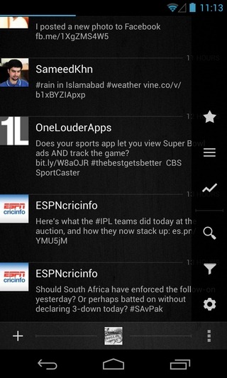
The first thing you’ll notice about the app is its sleek and beautiful layout, which is unique in quite a few aspects. A touch of Holo can be seen throughout the app’s UI that also sports multiple information-rich sidebars, semi-translucent new item notifications, detailed user profile views atop avatar-oriented full-screen backgrounds, visually-rich conversation threads, and a nice tilted effect for the drag-to-refresh gesture.
The main UI of the app is split into three tabs dedicated to displaying your Twitter Timeline, @Mentions and Direct Messages. The Timeline view shows all the latest tweets from the people you’re following, complete with inline photo and video thumbnail previews. You can interact with an item either by tapping it and performing the required action from the conversation screen, or by using the long-press gesture to select the action from the app’s main screen itself. To quickly navigate to the top or bottom of the screen, you can use two finger scrolling gesture. While switching between the three main screens, you’ll be able to see a quick navigation bar at the top that can help you jump to the required screen without having to swipe multiple times.
Tapping a user’s avatar lets you view their detailed Twitter profiles, complete with the number of tweets, friends, followers and @Mentions. From the same screen, you can retweet them, send them a Direct Message, add them to your Twitter Lists, filter their Tweets to keep them from showing on the Timeline without actually blocking them, report them as spammers, or block them completely.
Tapping the Menu button on the app’s main screen reveals a compact right sidebar that allows you to check out your favorite/starred items, items posted under your Lists, and all the trending tweets from a region of your choice. It is also from the same screen that you can perform a search across Twitter, keep a close tab on your Twitter filters in terms of people, hashtags & keywords, and head over to the app’s settings screen to manage notifications for @Mentions & Direct Messages, as well as add, remove and manage your Twitter accounts.
Now to the missing bits – as of now, Carbon doesn’t support posting tweets longer than the conventional 140-character mark – a feature supported by various third-party Twitter apps. Moreover, the app is not optimized for tablets, and does not support push notifications. You can’t save tweets as drafts, or attach videos or locations to them. Landscape orientation is also not supported, and there is no widget available for your Android home or lock screen.
If you don’t care about the aforementioned shortcomings, Carbon for Twitter will be worth a shot for you. The app requires Android 4.0 Ice Cream Sandwich or higher to run, and can be downloaded for free via the Play Store link provided below.

The official Android client of Twitter is decent enough to keep you hooked into your micro-blogging world on the move, but compared to some ...
Notifications Widget Displays All Alerts On Android Home & Lock Screen
Developed by XDA member Roymam, Notifications Widget is a customizable widget for Android 4.0.3 Ice Cream Sandwich and higher devices that replicates the looks and functionality of dismissible notifications introduced in Android 4.1 Jelly Bean and later iterations. Using the widget, you can view and interact with all the notifications that show up in your Android device’s notification shade. Be it a notification regarding a missed call or a new SMS/email, update alerts from Play Store, a Gtalk message, or any third-party app notification for that matter, Notifications Widget is capable of displaying them all on a compact home screen widget. If you have an Android 4.2 Jelly Bean or higher device, you can install Notification Widget to your device’s lockscreen to take a peek at all your latest notifications without having to unlock the device. In addition, the widget lets you directly launch relevant apps and dismiss all notifications at once with a mere tap.
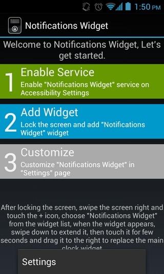
Notifications Widget works on both rooted and non-rooted devices. Once installed, you’re required to first enable the accessibility service for the widget so that it can effectively access the notifications. For this, the widget’s initial setup screen will itself guide you, as shown in the screenshot below.
Notifications Widgets is also capable of grouping similar notifications from each app into a single notification entry. In all such cases, it’ll keep you notified about the total number of unattended notifications via a counter. Notifications Widget also offers several customizations for the widget. For instance, you can set the widget to automatically activate the screen each time a new notification is received.
You can also have all your unattended notifications automatically dismissed as soon as you unlock the device. The action associated with the Clear/Dismiss All button on the widget can be synchronized with the corresponding actions in your device’s notification panel. This way, clearing the notifications on one side will automatically force the notifications to be wiped on the other side as well. Please note that this is an experimental feature that might not always work as intended.
When it comes to the layout, the digital clock sported by the widget can be hidden altogether, or you can select a custom size for it (large or small). Also, the time and text color for the notifications can be customized, in addition to adjusting the opacity level of the widget itself. If you don’t want the content of your notifications to be revealed, just uncheck the ‘Show full notification content’ option on the widget’s main preferences screen. Notification Widget is not yet available in the Play Store. However, you can grab its APK via the provided link and sideload it to your device like any other APK.

Developed by XDA member Roymam, Notifications Widget is a customizable widget for Android 4.0.3 Ice Cream Sandwich and higher devices that r...
Your Tube 8 Is A Simple YouTube App For Windows 8 With Better Search
Each day people from all walks of life upload thousands of videos on YouTube and other video hosting websites such as Vimeo and DailyMotion. Many individuals do it solely to share their videos with others, while professionals and organizations do it to promote their content or make money from ads. YouTube is one of the most visited websites on the internet and while Android and iOS have had their own official YouTube apps – complete with viewing, commenting and uploading features – for a long time, Windows 8 users have still been waiting for a dedicated YouTube client. Meanwhile, third-party solutions are being developed that allow you to view YouTube videos on your Windows 8 or RT device in Modern UI. Your Tube 8 is one such app that lets you browse YouTube videos and watch them from your Windows 8 or RT device without having to open the YouTube website in your browser. You can watch videos in small or full screen window, change the quality and share them with others. Moreover, you can filter videos according to different categories and types, and search for a particular one from the massive database.
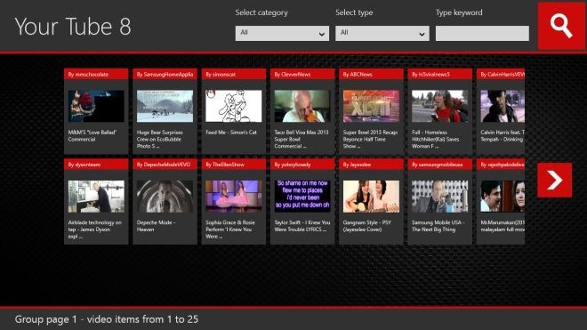
By default, the app displays videos of all categories and types on the main interface. Each video is listed with a thumbnail, name of the uploader, and the video’s name. You can scroll to the right side to reveal more videos in the list.
The Category and Type dropdown menus at the top allow you to view videos belonging to a particular category, or videos of a particular type. For instance if you are looking for top-rated videos in the music section, just select Music from Category and Top Rated from Type, and hit the search button.
If you are looking for videos matching a particular keyword, just enter it in the Type Keyword field available in the top-right corner, and hit the Search button. You can even select a category and type before searching to further narrow down the results.
Tapping a video starts playing it in a small window. Along with the video, you can view its rating, description, information, and number of likes and dislikes. Moreover, you are shown a strip of related videos in the bottom-right section, and you can start playing any of them by clicking them in the strip.
When playing a video, you’ll see buttons for full screen mode and sharing in the top-right corner. You can also change the speed and resolution of the video through the settings button in the bottom-right corner.
Hitting the Share button opens up the Share Charm, allowing you to share the currently playing video through all the supported apps such as Contacts and Mail.
At the time of this writing, Your Tube 8 does not have a login feature, which can be a very useful addition to access your favorite videos and manage your account. In addition, there should be an option to copy the video’s link directly to share it using any app, or open it in browser yourself. Your Tube 8 works on Windows RT and both 32-bit & 64-bit versions of Windows 8.

Each day people from all walks of life upload thousands of videos on YouTube and other video hosting websites such as Vimeo and DailyMotion....
Subscribe to:
Comments (Atom)
Popular Posts
- How To Run Any App In Full-Screen Mode On iPhone 5 & iPod touch 5G
- Notifications Widget Displays All Alerts On Android Home & Lock Screen
- Lenovo IdeaPad Yoga 13: A full-time laptop meets a part-time tablet
- Sleek Android Twitter App ‘Carbon’ Finally Arrives In Play Store
- This is the post without thumbnail

Labels
Text Text Text Text Text Text Text Text Text Text Text Text Text Text Text Text Text Text Text Text Text Text Text
My Blog List
About Me
Copyright 2013 (c) eNews
